KhrisDigital is supported by readers like yourself. We may earn a commission when you purchase through our links (at no extra cost to you).

Khris’ Take
I bought ConvertBox on a lifetime deal, and it’s easily one of my best business investments. This tool has generated tens of thousands of dollars in affiliate commissions with minimal effort. It’s simple, setup takes 3 minutes, reliable, and still works like a charm every day, even without flashy updates. If you want to capture more leads and boost sales without bloating your site, ConvertBox delivers.
| Best For | Marketers, Bloggers, and Affiliates |
| Price | $495/one-time |
You know that one tool you try on a whim… and then end up wondering how you ever lived without it?
That’s been ConvertBox for me.
I didn’t expect much at first. Just another pop-up tool, right?
However, it turned out to be one of the most quietly powerful additions to my site. Easy to set up, sneaky-good at conversions, and it just works, no fancy hacks, no overthinking.
Over the years, it’s helped me grow my list, boost affiliate revenue, and actually make money from visitors who were about to click away.
Here’s my honest ConvertBox review, including the good, the “meh,” and whether ConvertBox is still worth it today, even without constant updates or hype.
What Is ConvertBox?
If you’ve ever wanted a tool that feels like it’s doing the marketing for you, without being annoying or pushy, that’s ConvertBox.
It’s not just another pop-up builder.
It’s more like a smart little assistant that shows up at just the right time to say the right thing to your site visitors. Whether you’re trying to grow your email list, promote an affiliate offer, or direct people to a specific funnel, ConvertBox makes it incredibly easy.
But where did this thing come from?
Back in the day, it started as ConvertBar, created by Dean Saunders, a savvy marketer who clearly grew tired of clunky tools that felt like they were built in 2003. ConvertBar was the warm-up act.
Then, in 2018, it evolved into ConvertBox, with the same creator and brand-new platform, offering significantly more power under the hood.
 ConvertBox - Lifetime Deal
 ConvertBox gives you the flexibility to easily create popups, bars, forms to help build lists and drive more sales to your website and checkout pages. It comes with advanced and personalized features to engage visitors. All for a lifetime deal!
Then, in 2021, something significant occurred. Josh Bartlett (yep, the ThriveCart guy) acquired it. And if you’ve ever used ThriveCart, you already know Josh is all about building conversion-focused tools that are fast, clean, and work.
That move gave ConvertBox more polish, more attention, and honestly, more staying power.
Now? It’s quietly running on thousands of sites. No loud launch every other month. No shiny new features every Tuesday. Just solid performance.
Why Was ConvertBox Even Built?
Because most pop-up tools suck. Seriously.
They’re either too limited or way too bloated. ConvertBox was built to hit that sweet spot: easy to use, crazy flexible, and smart enough to target people based on where they came from, what they clicked, how long they stayed, all that good stuff.
Want to show a lead magnet to new visitors only? Done. Want to offer a discount only to people on your pricing page for more than 30 seconds? Easy. Want to segment your audience without scaring them away? Yup, it does that too.
And a bonus: they offered a ConvertBox lifetime deal that made many of us early users feel like we had gotten away with something.
My Favorite Features of ConvertBox
No Plugin Bloat (Thank You, ConvertBox)
Okay, I’ll admit, this feature might not sound all that exciting on the surface. But if you’ve ever managed a WordPress site, you know the pain: too many plugins = slow site, constant updates, random conflicts, and headaches you didn’t sign up for.
That’s why I love how ConvertBox works. Yes, they do offer a WordPress plugin if you’d like it. But you don’t actually need it. All it takes is a simple script added to your site’s header, and boom, you’re up and running. No heavy plugin is slowing down your site speed.

For me, that’s a big win. Most other tools in this space, such as ThriveLeads and Sumo, require complete installations that add unnecessary weight. ConvertBox keeps it lean.
And here’s the kicker: it’s not just for WordPress. You can drop ConvertBox on practically any web page you control. Landing pages, Shopify stores, custom-built sites, you name it. That kind of flexibility means you’re never boxed in.
Honestly, the simplicity here is underrated… but once you experience it, you’ll never want to go back.
Easy-to-Use Drag-and-Drop Editor
I’ll be honest, I have zero patience for clunky editors. If a tool makes me feel like I need a degree in computer science to move a button, I’m out.
That’s why I actually enjoy building with ConvertBox. The editor is drag-and-drop simple, but without feeling cheap or limited. You can tweak layouts, swap images, adjust colors, change text, and move elements around in seconds, no coding, no stress.
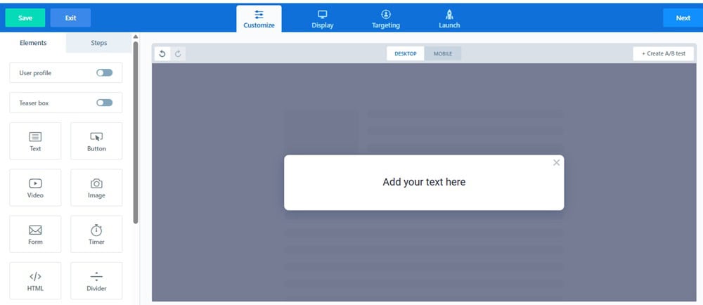
It feels kind of like playing with Lego blocks for marketers: snap things into place, move them if they don’t fit, and suddenly you’ve got something that looks clean and professional.
What I like most? It’s fast. You’re not sitting there waiting for endless reloads or dealing with lag. You make a change, you see it instantly. And that makes testing and experimenting way less painful.
So even if you’ve never designed a single opt-in box before, ConvertBox makes you look like you know what you’re doing.
Painless A/B Testing Without the Headaches
Marketers have been preaching the benefits of A/B testing for decades, and for good reason. It’s one of the easiest ways to squeeze more conversions (and more revenue) out of the same traffic.
The problem? Most tools make split testing a pain. Complicated dashboards, confusing setups, and data you need a PhD to interpret.
ConvertBox flips that on its head.
You can literally test anything: headlines, button colors, copy, layouts, offers, whatever you want. And setting it up takes less than a minute. Inside the editor, you click “+Create A/B Test”, then “Create New Variation.” Boom.
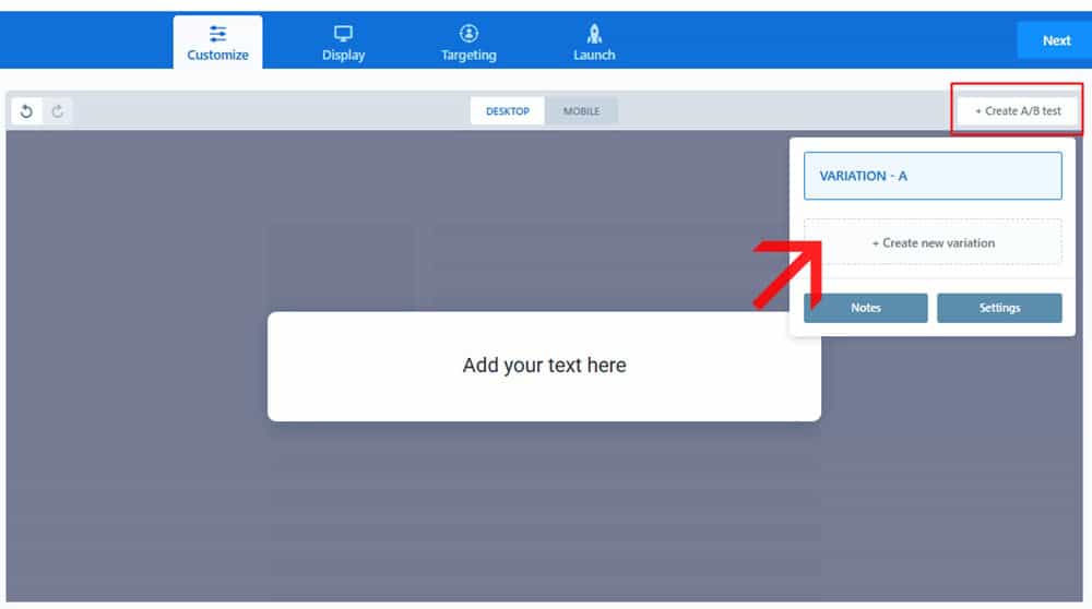
It clones your first version (Variation A), allowing you to tweak Variation B as needed. Want to run C, D, E? Go for it.
As I’m writing this, I’ve been running two variations of an exit-intent full-page overlay on a few of my pages.

After about a week, the results are precise: Variation B is pulling ahead
And here’s what I love, the reporting isn’t bloated or overwhelming. It’s simple, easy to read, and tells you what you actually need to know: which variation is winning.
It’s split testing without the spreadsheets.
Templates That Don’t Make You Feel Like a Designer
One of the first things I noticed about ConvertBox was the templates. Honestly? They’re a lifesaver. You don’t need a shred of coding knowledge or design skills to spin up something that looks clean and professional.
At its core, ConvertBox gives you two main “modes” to work with:
- Overlay – these sit on top of your page (think popups).
- Embed – these sit within your content (more subtle, like in-line forms).
And inside each mode, you’ve got different styles to choose from:
For Overlays, you can go with:

- Sticky bar – perfect for quick promos or countdowns at the top or bottom of your page.
- Callout modal / Slide-in – slides in from the corner, great for welcome messages or gentle nudges.
- Center modal – your classic pop-up, right in the middle of the screen.
- Full-page overlay – when you want to command all the attention (exit-intent offers, launches, etc.).
For Embeds, you’ve got:

- Large embed – ideal for dropping into blog posts or landing pages where you want a dedicated opt-in block.
- Small embed – a neat little form you can tuck into sidebars or content sections without breaking the flow.
The cool part? You can mix and match these however you want, depending on your strategy. Some subtle. Some loud. All effective.
Targeting & Behavioral Rules: Where ConvertBox Gets Surgical
This is the part of ConvertBox that makes me feel like I’ve got a scalpel in hand, rather than a blunt marketing hammer. It’s not just about showing a form, it’s about showing the proper form to the right person at the right time.
Inside the editor, there’s a Targeting tab. You can keep it simple and “Show to all visitors” (the default). Or, you can flip the switch to “Target specific visitors,” and that’s when things get fun.

Here’s what you can do:
- Show a pop-up only to visitors from a specific location.
- Trigger a message after a user has hit X number of page views.
- Target based on session count (first-timers vs. returning visitors).
- Use URL parameters to personalize the experience (perfect for paid traffic).
- Switch it up by device type — mobile users receive one offer, while desktop users receive another.
- Re-engage people who’ve already seen a specific ConvertBox.
- Even layer in rules from your email autoresponder activity (like showing different CTAs to subscribers vs. non-subscribers).
And here’s the kicker: you can stack rules together using AND/OR logic. So instead of “show this to everyone in the U.S.,” you can say “show this to U.S. visitors on mobile who’ve visited at least three pages but haven’t subscribed yet.”
That’s not just marketing, that’s precision. And it’s where ConvertBox moves from being a “nice little opt-in tool” to being a serious conversion weapon.
Plenty of Customization Options
You know how some tools offer “customization,” but really, all you can do is change the headline and button color? Yeah… not here.
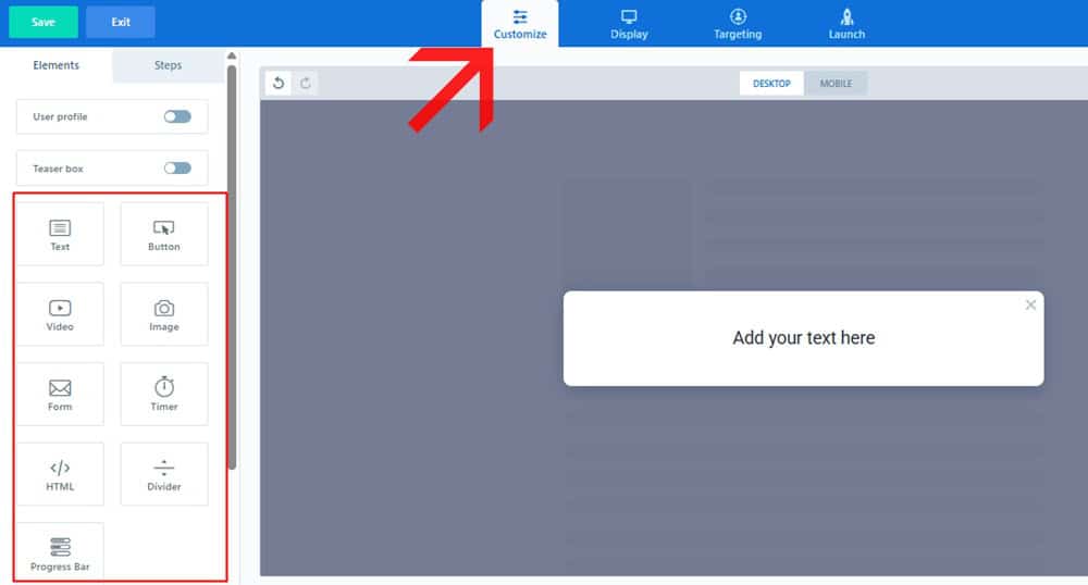
With ConvertBox, you can tweak just about everything — fonts, colors, images, backgrounds, spacing, buttons, call-to-actions — the whole vibe. Want a sleek, minimal opt-in? Easy. Want something loud and attention-grabbing with a big countdown timer? Done.
I love that I can tailor each ConvertBox to fit the context of the page. If it’s a blog post, I’ll go subtle, maybe a small slide-in or embed that blends into the content.
Is it a product page or a limited-time promotion? I’ll go bold, full-screen overlays, sticky bars, and countdowns that scream urgency.
And here’s the kicker: all that customization doesn’t eat up hours. It’s quick. You’re not stuck fiddling with CSS or begging a designer for help. A few clicks, a few tweaks, and you’ve got a box that actually feels like your brand.
It’s the perfect balance: powerful enough to look custom, simple enough that you don’t get lost in a design rabbit hole.
Multiple Form Options
One thing I’ve learned about growing an email list is that no single form style works everywhere. What works on a blog post won’t necessarily work on a sales page, and what works for mobile traffic won’t always work for desktop.
That’s why I love that ConvertBox offers multiple form options to experiment with.
Sometimes I’ll drop in a sticky bar for a subtle promo, just a slim banner across the top or bottom of the page. At other times, a slide-in modal works better, gently appearing in the corner without taking over the entire screen.
When I really want attention? That’s where the center modals or full-page overlays come in. Perfect for exit-intent offers or time-sensitive deals where I can’t afford to let people slip away.
And then there are the embedded forms, small or large, which I use directly within the content. These are especially handy in blog posts, because they feel like a natural part of the reading flow rather than a disruption.
The best part is how easy it is to test and experiment with different combinations. I can run a sticky bar on one campaign, a slide-in on another, and an embedded form on a blog post, all without juggling a dozen different tools.
Sticky Bar (Top or Bottom)
Sometimes you don’t want to hit visitors with a giant pop-up. You need a quiet little reminder that follows them around until they’re ready to take action. That’s where the ConvertBox sticky bar shines.
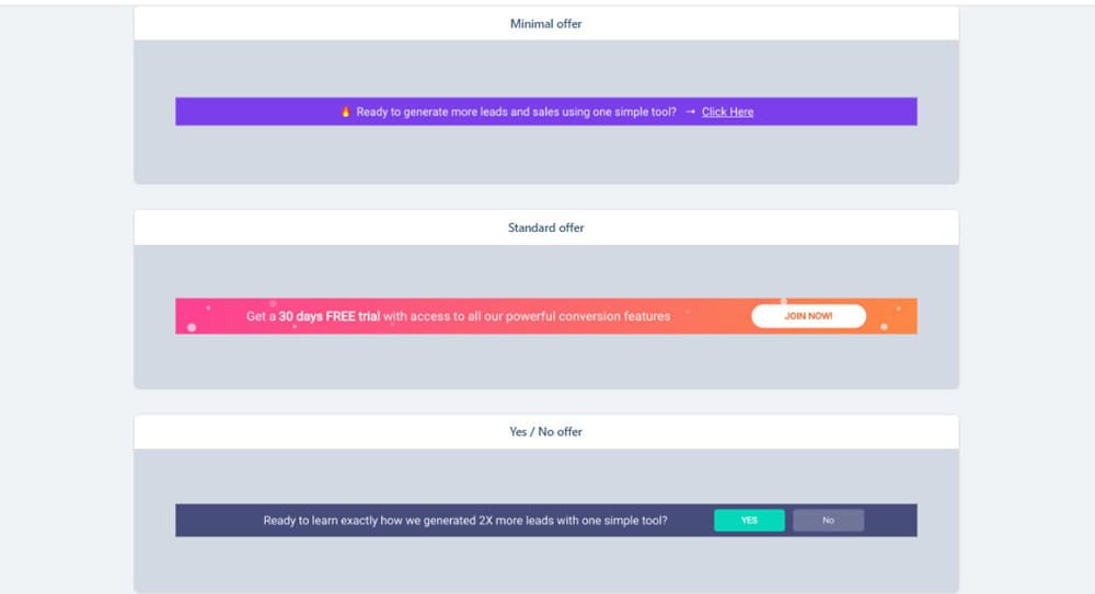
It’s a slim bar that sits neatly at the top or bottom of your page — always visible, always there, but never in the way. Think of it as your site’s polite salesperson: “Hey, so that you know, there’s a deal waiting if you want it.”
I’ve used sticky bars for all sorts of things:
- Highlighting a limited-time offer without interrupting the reading experience.
- Sharing a new blog post or resource I really want people to see.
- Adding countdown timers for launches or seasonal promos (these work really well).
What I love most is its versatility. On blog posts, it feels subtle and non-intrusive. On sales pages, it adds that extra layer of urgency.
And because it’s always “stuck” in view, you don’t have to worry about visitors scrolling past and forgetting your offer.
Slide-Ins/Callout Modals That Feel Like a Friendly Tap on the Shoulder
Popups can be pushy. But ConvertBox slide-ins (also known as callout modals)? They’re more like a gentle nudge.
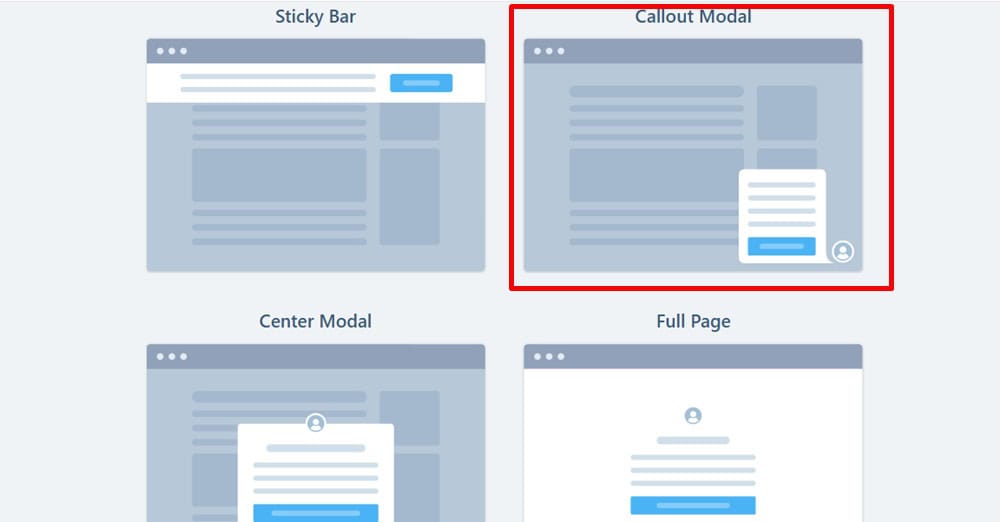
Instead of hijacking the whole screen, these little boxes glide in from the corner, just enough to grab attention without being annoying. I love using them to welcome new visitors, highlight a special offer, or share a quick tip that matches the page they’re on.
One of my favorite tricks? Adding a short video inside the slide-in. It feels way more personal, like I’m actually saying, “Hey, here’s something you’ll love.”
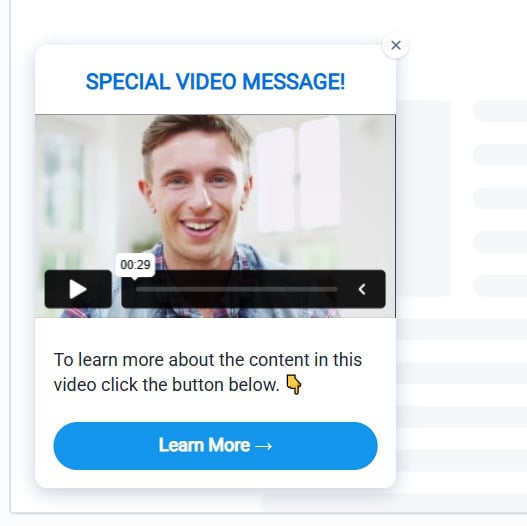
They’re flexible too — bottom left, bottom right, timed delay, exit intent. You set the rules.
And the best part? People actually engage with them. It’s subtle marketing that doesn’t feel like marketing.
The Classic Center Modal That Still Works Like Magic
Sometimes subtlety isn’t the play. Sometimes you need all eyes, right here, right now. That’s where the center modal comes in. It’s the classic pop-up, right in the middle of the screen, impossible to ignore. And honestly? It still works like a charm when used the right way.
I usually save center modals for moments that really matter: a limited-time promo, a lead magnet I know delivers value, or an affiliate bonus I don’t want people to miss.
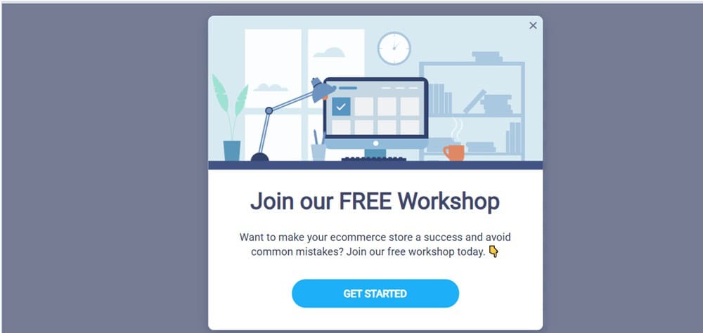
The cool part with ConvertBox is how easy it is to customize. You can keep it sleek and simple or dress it up with images, countdown timers, and even multi-step forms.
Yes, it’s bold. But sometimes bold is exactly what converts.
Full-Page Pop-Ups: When You Want Undivided Attention
Sometimes, you don’t just want attention; you need it all. That’s when I reach for the full-page pop-up in ConvertBox.
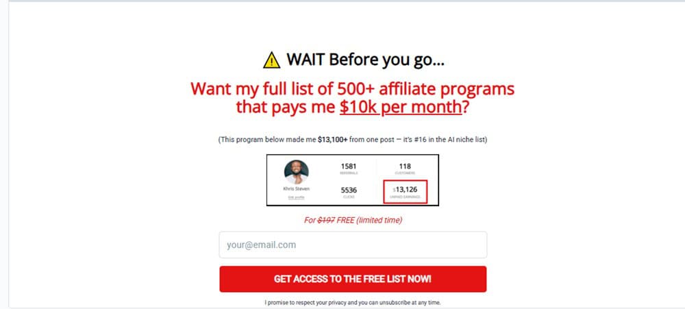
Unlike a slide-in or sticky bar, this takes over the entire screen. It’s bold, unmissable, and perfect for moments when your offer deserves to take center stage.
I’ve used full-page pop-ups for exit-intent campaigns, big product launches, and seasonal deals. For example, during a Black Friday promo, I had one appear just as visitors were about to leave. Instead of bouncing, a surprising number stuck around and grabbed the deal.
The beauty is, you can still design it however you want. Please keep it clean with a simple headline and CTA… or go all out with images, countdown timers, and bonuses.
It’s not something I use daily, but when I do? It delivers.
Embed Forms That Blend Right Into Your Content
Not every opt-in needs to be loud and in your face. Sometimes the best way to capture leads is by making the form feel like a natural part of the content. That’s where ConvertBox embed forms shine.
You’ve got two flavors: large embed and small embed. The large version is perfect for dropping into blog posts or landing pages — almost like a mini lead capture section. I’ve used this in long-form content where it feels like a helpful “next step” instead of an interruption.
The small embed is more subtle, such as in sidebars, beneath articles, or tucked between paragraphs. It’s great for gently nudging readers without breaking their flow.
What I love most is how easily they can be styled to look like they belong. No clunky mismatched boxes. Just clean, branded forms that work quietly in the background to grow your list.
Here’s a fresh, engaging version for Basic Mobile Editing:
Mobile-Friendly Without the Headache
Here’s the truth: most of your visitors are probably coming from their phones. Which means if your forms look clunky on mobile, you’re basically leaving money on the table.
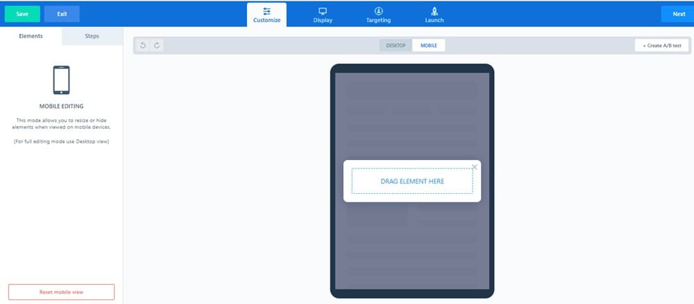
That’s why I appreciate ConvertBox’s mobile editing options. They’re not overcomplicated, but they provide just enough control to ensure your boxes look clean and clickable on smaller screens.
You can adjust spacing, tweak font sizes, and decide whether a specific form should even show on mobile at all.
What Happens After the Click? (Actions After Submission)
Getting someone to fill out a form is only half the battle. What happens next can make or break the conversion. That’s why I love the Actions After Submission options inside ConvertBox.
Instead of just saying “Thanks for subscribing,” you get to choose what happens. Would you like to redirect them to a custom thank-you page? Easy. Would you prefer to deliver a lead magnet instantly? Done.
Perhaps you’d rather tag them in your email tool, add them to a segment, and then display a personalized offer to them on the spot? All possible.
It’s these little details that make ConvertBox feel smarter than the average opt-in tool. You’re not just collecting emails; you’re guiding people into the next step of your funnel.
Form Fields That Actually Fit Your Strategy
Here’s the thing about most opt-in forms: they’re either too basic (name + email) or too complicated (a laundry list nobody wants to fill out). ConvertBox strikes the perfect balance with its flexible form field options.
You can keep it simple, name and email for a quick lead capture. Or, if you’re segmenting, add extra fields like dropdowns, radio buttons, or checkboxes. I love this because it feels less like “data collection” and more like starting a conversation.
The best part? You’re in complete control. Collect only what you need, nothing more, nothing less.
Triggers & Rules That Put You in Control
Ever land on a site and get hit with a pop-up in the first two seconds? Annoying, right? With ConvertBox display options, you don’t have to be that marketer.
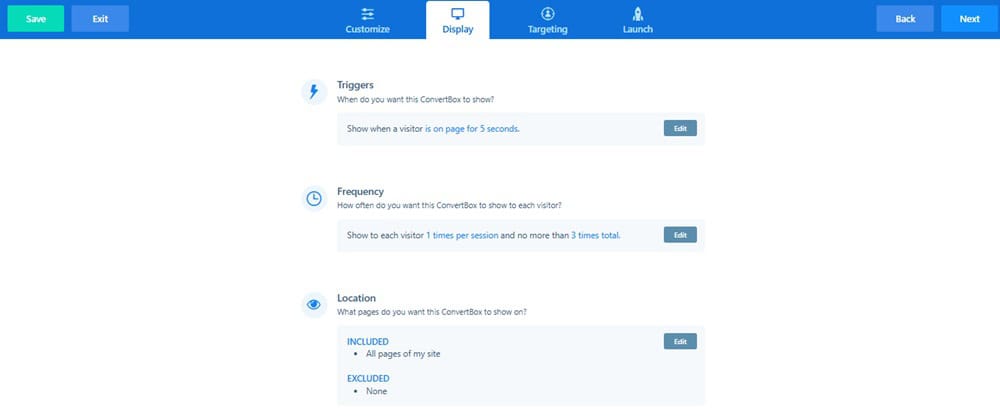
You’re in complete control of when and how your boxes appear. Want a form to slide in only after someone scrolls 50% down the page? Easy.
Would you prefer to trigger a full-page overlay only when users are about to exit? Done. You can even set delays, target specific buttons or link clicks, and choose whether forms should reappear for returning visitors.
One of my favorite setups is using exit-intent triggers on affiliate pages. Visitors are about to leave, and boom, they see a quick bonus offer. It’s subtle, but powerful.
These triggers and rules let you meet your audience at the right moment instead of interrupting them at the wrong one, and that’s why they convert.
Show It Where It Matters (URL Targeting Made Simple)
Not every message belongs on every page, and that’s where ConvertBox’s URL inclusion and exclusion rules come in clutch.
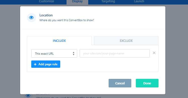
Instead of blasting the same pop-up across your entire site, you can decide exactly where each ConvertBox shows up (and where it doesn’t). Want a lead magnet to appear only on blog posts?
Done. Want a sticky bar to run just on your sales pages? Easy. Do you need to exclude your thank-you pages so people don’t see the same offer twice? No problem.
It’s a small detail, but it makes your campaigns feel smarter and way less “spammy.” Because the right offer in the wrong place is just noise, and ConvertBox helps you avoid that.
Multi-Step Forms That Feel Like a Conversation
Nobody likes staring at a giant form asking for five different details all at once. It feels overwhelming, and most people click away. That’s why I love ConvertBox’s multi-step forms.
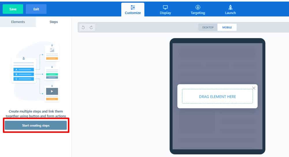
Instead of dumping everything on visitors upfront, you can break it into bite-sized steps. Ask one simple question first, like “Are you a blogger or a business owner?”, and then guide them based on their answer. It feels less like a form, more like a conversation.
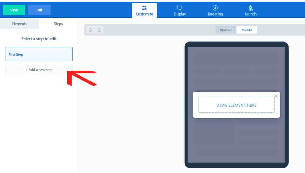
I’ve used this to segment visitors without scaring them off. They start with an easy click, then another, and by the time they reach the email field, they’re already invested. Conversion rates? Way higher than a single, bulky form.
The beauty is in the psychology: small commitments lead to bigger commitments. And ConvertBox makes it ridiculously easy to build that flow.
Schedule It and Forget It (ConvertBox on Autopilot)
One of the sneakiest time-savers in ConvertBox is the ability to schedule your campaigns. Instead of manually turning boxes on and off, you can set them to run during exact dates and times, and let the tool do the heavy lifting.
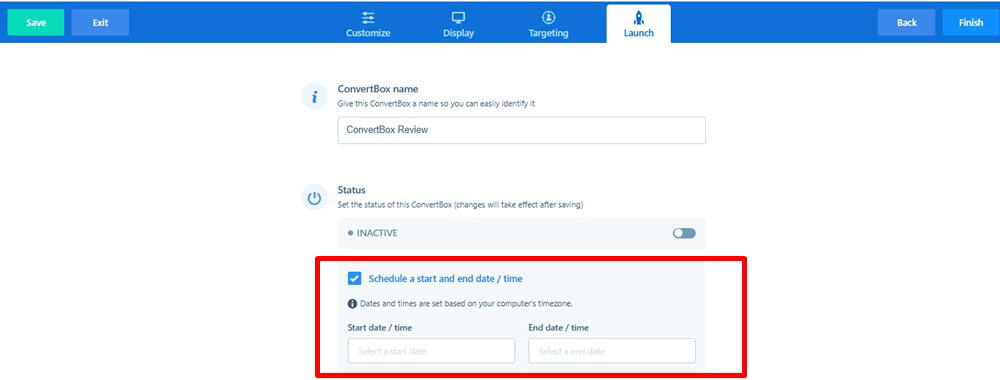
For example, during Black Friday, I scheduled a sticky bar to go live at midnight and automatically switch off once the sale ended. No alarms, no late-night logins, it just worked.
This is also perfect for product launches, webinars, or seasonal offers. You can prep everything ahead of time, schedule it, and then focus on promotion while ConvertBox quietly handles the timing in the background.
Basic Analytics (Good, But Could Be Better)
I’ll be honest with you, the analytics inside ConvertBox are… fine. They get the job done, but they’re not as detailed as I’d like.
You can view the basics, including total views, interactions, and conversion rates, for each ConvertBox. For example, I’ve got one campaign running across a dozen related blog posts, and it shows me an 8.43% interaction rate. Not bad.

But that’s all I see. No breakdown by page. No way to know which posts are actually pulling the most clicks.
And that stings a little, because page-by-page stats would help me double down on what’s working and cut the dead weight. With that kind of insight, optimizing campaigns would be so much easier.
So yeah, the analytics are helpful for a quick overview, but if you’re a data junkie like me, you’ll probably wish it went deeper.
Support That Actually Shows Up
I’ve had my fair share of headaches with tools where support feels like yelling into the void. Thankfully, ConvertBox hasn’t been one of them.
When I first activated ConvertBox on my site, it flat-out refused to show. As a non-techy person, I was this close to pulling my hair out. So I opened a ticket, crossed my fingers, and to my surprise, I had a helpful reply waiting in my inbox about six hours later.

Not instant, but honestly? Not bad at all.
Now, there’s no live chat or 24/7 hotline, but they do make up for it with a couple of things:

- A Facebook group that feels like a small community of users sharing tips and solutions.
- A surprisingly detailed knowledge base/Help Desk, where you can usually find answers without even reaching out.
So while support isn’t “white-glove,” it’s reliable, and that matters.
5 Creative Ways To Implement ConvertBox in your Business
I’m going to show the complete ConvertBox interface, how to create your first ConvertBoxes and other things you need to know.
But first, I want to single out some use cases where I think ConvertBox excels (better) in comparison to other lead capture platforms.
1. More Creativity With Opt-in Forms
There are plenty of tools out there for collecting emails, some good, most clunky.
But ConvertBox? It makes the whole process feel effortless. You’re not just stuck with one boring opt-in form. You’ve got options, lots of them, and they actually make sense for how people behave on your site.
As someone running an online business, you already know how important it is to build an email list — it’s traffic you own, not rent. But to grow it smartly, you need more than just a form slapped in the sidebar. You need flexibility. Strategy. Control.
That’s precisely where ConvertBox crushes it.
You can create:
- Sticky bar opt-in

- Slide-in/Callout modal opt-in

- Full-page overlay opt-in

- Center modal opt-in

Whichever of the opt-in form type you choose to deploy on your site – it comes with various display options settings, to trigger how, and where you want it shown to your visitors.
No tech headaches. No overthinking. Just high-converting forms that feel good to use, for you and your visitors.
2. Create CTA Boxes
Let’s say you’re not interested in collecting emails and build your email list. Just the way I don’t on most of my review posts.
And you just want to drive your visitors to click through to a certain page or an affiliate offer.
Then you’ll find this one very useful.
All you have to do is create a ConvertBox with text and a CTA button. You can also add images (preferably) to the fullscreen overlay.
Just as the opt-in options, you can have these boxes come as a sticky bar, slide-in page, overlay, etc.
A typical example of this is being used on this page, I’m using the exit intent trigger option. Just attempt to exit this page – you’ll see it pop up.
For example:
Here is an example of a CTA box I’m using on my Thrivecart review post:

3. Interactive Quizzes
Okay, complete transparency: I haven’t rolled this one out yet. However, the potential here is truly immense.
ConvertBox lets you build unlimited interactive quizzes right inside your site, blog, or funnel — and not the boring kind. These are smart, targeted, and completely customizable.
You can deploy them as full-page overlays, embed them into your content, or set them up as slide-ins that appear on the bottom corners of the screen. It’s all based on templates designed for segmentation, so you’re not starting from scratch.
The best part? You can connect quiz answers to your email platform, tag users based on their responses, or, if you’re not collecting emails, redirect them to the perfect offer, totally up to you.
Here’s how I plan to use it:
Let’s say someone lands on my post about the best white-label sales funnel builder. Instead of a generic lead magnet, I’d trigger a slide-in that gently asks:
“Do you use funnels in your business?”
– Yes
– No
If they say yes, I’ll guide them through a few quick questions:
What are you looking for in a funnel tool?
What’s your experience level?
Then, boom, they hit a point where they enter their email to get a tailored recommendation. Not just another lead… but a qualified one.
If they say no, no problem. I’d walk them through a quiz designed for total beginners, something helpful that nudges them toward the right tool to get started.
I haven’t implemented this yet (depending on when you’re reading this), but the idea is already sketched out in my mind. And I’m seriously excited to test it.
You get the idea, right? This feature has serious potential for boosting engagement and conversions, without being pushy or boring.
4. Create Countdown Timers That Actually Work
If you run time-sensitive offers such as launches, promotions, or affiliate deals, you already know that urgency sells. But here’s the thing: fake countdowns feel sleazy. People can smell the manipulation.
That’s why I love how ConvertBox handles countdown timers. They’re real, clean, and built for actual marketers who want urgency without being shady.
I’ve used this feature numerous times, and it continues to deliver.
During Black Friday, I set up a ConvertBox to promote my Bluehost affiliate deal. Nothing flashy, just a simple exit-intent pop-up with a ticking countdown and a reminder that the deal was going away soon.

It pulled in conversions I would’ve otherwise lost.
Another time? I ran a sticky bar countdown during the launch of the Own Your Future Challenge, from Dean Graziosi and Tony Robbins.
Once-a-year offer. Short window.
That sticky bar stayed glued to the top of the page, reminding visitors to grab their spot before the doors closed.

No dev work. No stress. Just real urgency that gets results.
Whether it’s a flash sale, early-bird offer, or last-call bonus, ConvertBox lets you drop a countdown exactly where it makes sense… and then watch the conversions roll in.
5. Welcome or Announcement Video Messages
One of my favorite things about ConvertBox is how natural the slide-in and call-out modals feel.
They’re not those in-your-face popups that make people want to smash the “X.” Instead, they slide in quietly, catch your eye, and when used right, feel more like a friendly tap on the shoulder than an interruption.
A clever way to use them? Welcome messages for first-time visitors. I’ve seen people add a short video introduction, a quick “Hey, here’s who I am and how I can help you.” It’s personal, it’s different, and it builds instant trust.

Another slick use case: announcements. Got a new product, fresh update, or running a promo? Instead of burying that news in an email that might never get opened, you can put it right in front of visitors while they’re already engaged with your content.
But here’s where it gets really fun:
- You can trigger announcements based on location (say hello to your UK visitors with a special offer).
- Display different welcome messages based on the page a user lands on.
- Or even trigger a ConvertBox when someone clicks a link or image, meaning you can use overlays on other people’s pages without touching their site.
How To Use ConvertBox (step-by-step tutorial)
This is an inside look at how to create your first ConvertBox and launch it.
Getting started with ConvertBox
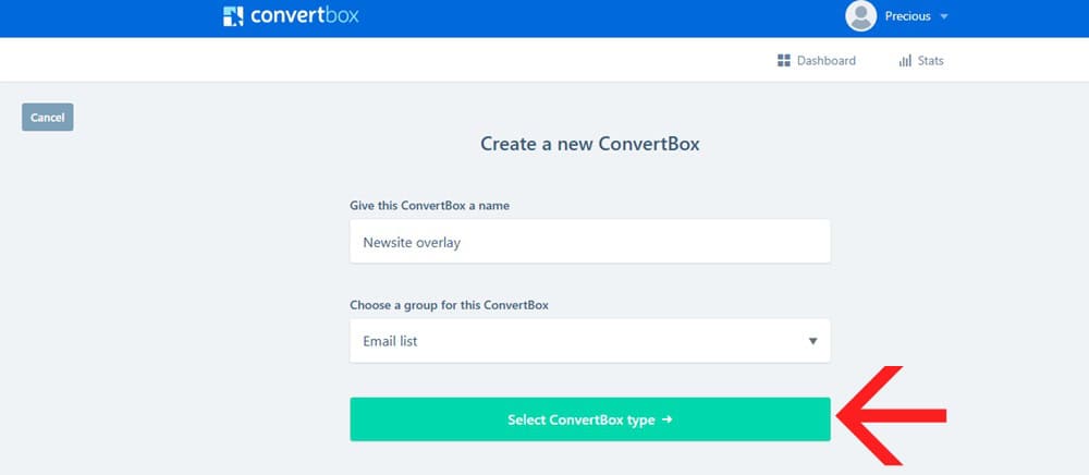
In creating your first ConvertBox you’ll have to click on “+ New ConvertBox“.

Which opens up the window where you give your ConvertBox a name. Next, you have the option to create a new group or select from the existing group.

Think of a ConvertBox group like a folder for all your campaigns. It’s a simple way to keep everything tidy and organized, and trust me, once you’ve got multiple boxes running, you’ll be glad for the structure.
I like to keep things organized: all my exit-intent popups reside in one group, while my opt-in forms are stored in another. It makes managing them a whole lot easier.
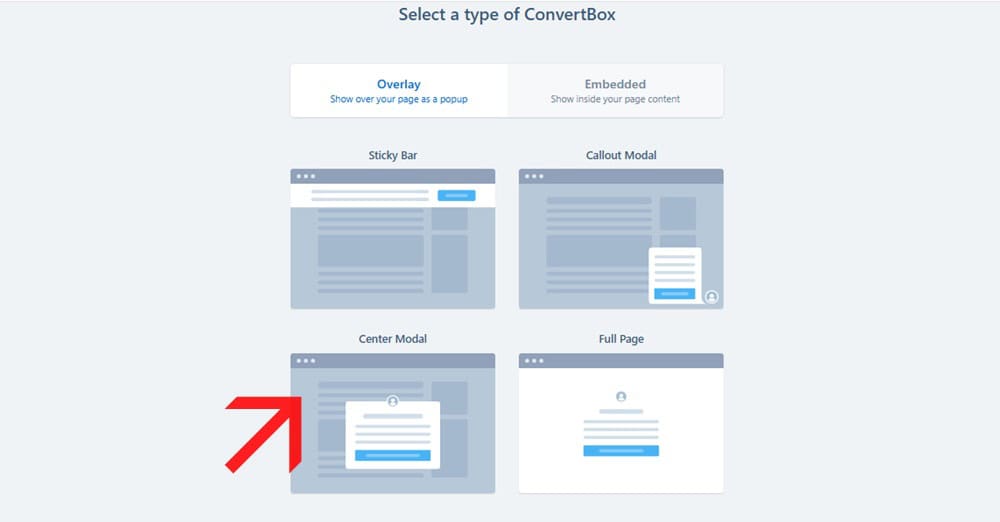
Once your groups are set, the next step is choosing the ConvertBox type you want to build.
After that, you pick from the available templates.
For this demo, let’s use a center modal (the classic pop-up positioned right in the middle of the screen).
From there, you can select a template based on your goal, whether that’s collecting leads, driving clicks, promoting a limited offer, running a quiz, sharing a video message, or making an announcement.

Of course, if you’re the creative type, you can skip the templates and start from scratch with a blank canvas.
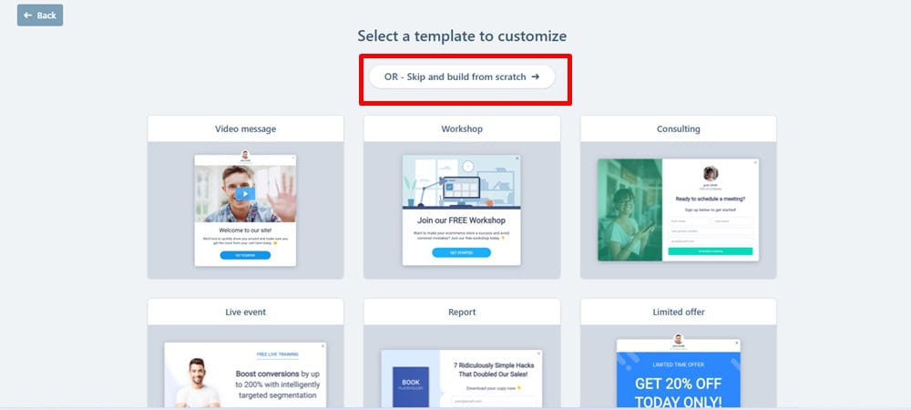
Me? Yeah… not happening.
I’d rather not reinvent the wheel when ConvertBox already gives me polished options to work with.
For this review, I’m using the “Lead Gen” template, which is quick, simple, and straight to the point.
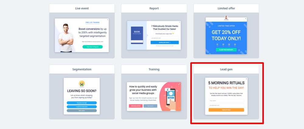
What I really like about these templates is how fresh they look right out of the box. The colors pop, the buttons feel clickable, and swapping out text, images, or elements in the editor is ridiculously easy.
No wrestling with code, no design headaches, just a few clicks, and it feels like something I actually designed myself.
Inside the ConvertBox Editor
Customizing your ConvertBox goes almost the same way as you would usually use some page builder editors.
Drag and drop.
You can change anything. Add anything. The way you want.

Just as with every editor – the customization elements are always found on the left or right sidebar.
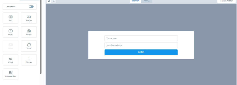
Add Texts. Buttons. Video. Image. Progress bar. etc to your form builder.

As you can see, when I toggled the “user profile” (1) on the sidebar – it shows my avatar above the form (2).
Within the customizer, you can change your ConvertBox type (3). Instead of trying to go back changing it. Which requires saving the current work and starting all over again.
You can switch to mobile view to edit how you want your form to feel on mobile (4).
Finally, you can create multiple form variations for split testing your opt-in form (5).
Clicking on any of the form elements (texts, buttons, and text fields) shows its correlating settings. Like this:

- Form actions: Where you indicate what should happen when someone submits the form. This is where you integrate your autoresponder
- Form field: You create, add, or edit the form field
- Form size
- Change button font style
- Button color
- Button text color
Out of the editor…
ConvertBox Display Targeting

Starting with Triggers.
This allows you to set when a ConvertBox shows on your page.
My favorite is page abandonment. Also called exit-intent. It Shows when a visitor attempts to leave the page.

You can check more than one basically.
Next is Frequency. How you want your ConvertBox to show visitors.

You can choose to show your ConvertBox every time the visitor views your page. OR…
Set how many times each visitor will see your ConvertBox and also the maximum times they will see it per day.
Finally, for the Display rule, we have Location.
This is where you set pages on your site to display and not display your ConvertBox.

Next is ConvertBox Targeting…
You can choose to show your ConvertBox to all visitors or go down the rabbit hole of targeting specific visitors using the conditional rules.
Let’s leave it at “Show to all visitors”.
Finish and Launch!

The final step/stage. This is where you activate your ConvertBox to take effect on your site.
You can even schedule your form to begin and end at a specific day and time.
Interesting!
ConvertBox Pricing
One of the biggest reasons people rave about ConvertBox is the pricing model.
Instead of being locked into monthly or yearly subscriptions, ConvertBox has been offered as a lifetime deal, pay once, and you’re set. That alone makes it stand out in a world where most marketing tools bill you endlessly.
The Standard Lifetime Plan is priced at $495 (one-time). With this plan, you’re set up with everything you need to grow and scale your campaigns without worrying about extra charges.
- Use on up to 10 websites
- 250,000 monthly views
- Unlimited ConvertBoxes and campaigns
- All core features: A/B testing, quizzes, multi-step forms, countdown timers, targeting rules, and more
- Ongoing support and updates included
For those running bigger operations — maybe you manage multiple sites, client accounts, or get a lot more traffic — the Pro Lifetime Plan is the natural step up.
For an additional $95 (totaling $590 one-time), you unlock more breathing room and flexibility.
- 500,000 monthly views
- Use on up to 50 websites
- 5 sub-user logins (ideal for teams or agencies)
Both plans give you access to the full power of ConvertBox without recurring bills.
And the fact that you get ongoing updates and support baked in means you don’t feel like you’re buying “frozen software” — it continues to improve without draining your budget.
What I Love and Don’t Love About ConvertBox
ConvertBox Pros
ConvertBox Cons
Who Is ConvertBox For?
Look, ConvertBox isn’t some cookie-cutter lead-gen tool trying to be everything to everyone. It was built with a specific type of user in mind, people who care about conversions but don’t want to spend hours tinkering with tech or babysitting funnels.
If you’re someone who wants more intelligent targeting, clean design, and results without the bloat, you’re in the right place.
Let’s break it down.
Bloggers, Ecommerce Websites, Course Creators
(Grow Your Email List)
If you’re building an audience or selling anything online, ConvertBox can quietly become your best-performing team member.
You can set up forms that appear only after someone scrolls, clicks a button, or is about to leave — and personalize the message based on the page they’re on. It’s like giving your opt-in box a brain.
For bloggers, this means turning readers into subscribers with contextual offers (think: lead magnets that match the post topic).
For ecommerce, use it to recover abandoned carts or promote time-sensitive offers to warm browsers.
And for course creators? Build micro-funnels right inside your site. Capture interest. Segment by topic. Tag by behavior. All without duct-taping five different tools together.
Agencies, Small Businesses
(Capturing Leads for Your Local Business or Clients)
Agencies, listen up: ConvertBox is gold when managing lead generation for multiple clients and needing to keep things clean and easy.
You can run different ConvertBoxes across various client sites, each with its own rules, integrations, and targeting.
Running a local business? Whether it’s a dentist’s office or a real estate team, you can capture leads based on location, device, or referral source. Would you like to offer a discount to people coming from Facebook ads? No problem. Want to display a booking form only on mobile devices? Easy.
Additionally, it integrates with Zapier, making it easy to route leads to CRMs or autoresponder tools. No more dealing with half-working forms or clunky builders that don’t respect design.
Affiliate Marketers
This is where ConvertBox really earns its keep.
If you’re doing affiliate marketing, you know the most challenging part is keeping people on the page long enough actually to click your link.
With ConvertBox, you can:
- Trigger exit pop-ups that highlight your bonus or offer
- Add sticky bars with countdowns or urgency copy
- Create simple opt-ins that deliver bonuses in exchange for emails
And here’s the kicker: you can build these in minutes, without needing to be a designer or developer.
It also helps segment traffic by interest, so you’re not sending the same message to everyone. You can show different offers to people coming from your email list vs. cold Google traffic.
I’ve personally used it on dozens of affiliate pages, it just works.
Who ConvertBox Was Not Built For
Okay, let’s be honest, ConvertBox isn’t for everyone.
If you’re looking for some giant, enterprise-level platform with heatmaps, A/B tests on steroids, session recordings, and deep analytics dashboards — this ain’t it.
If you want a full-blown funnel builder with upsells, downsells, order bumps, and checkout pages, consider tools like ClickFunnels or ThriveCart.
And if you’re the type who needs a constant stream of new features and updates every two weeks to feel like your tool is “active”? You’ll probably get frustrated here. ConvertBox is more of a set-it-and-forget-it kind of tool, quietly powerful, but not flashy.
What Tools Does ConvertBox Integrate With?
Here’s the beauty of ConvertBox: it doesn’t live in a silo.
It plays really well with the tools you’re already using — email marketing platforms, CRMs, eCommerce solutions, webinar software, even analytics.
Out of the box, ConvertBox integrates directly with many of the big names marketers rely on every day, including:
- Email platforms like ActiveCampaign, ConvertKit, GetResponse, AWeber, Drip, MailChimp, MailerLite, HubSpot, Moosend, Sendinblue, and Klaviyo.
- CRMs & automation tools, such as Ontraport, Infusionsoft (now Keap), and Platform.ly.
- Funnels & page builders like ClickFunnels and Leadpages.
- eCommerce & checkout with Shopify and ThriveCart.
- Webinars & events with platforms like Demio.
- Analytics through Google Analytics.
- Additionally, you can even incorporate HTML forms if you prefer a more traditional approach to control.
And if your favorite tool isn’t listed? No stress. ConvertBox also integrates with Zapier and webhooks, allowing you to connect it to hundreds of other apps without lifting a finger.
The best part is how seamless it feels. You’re not wrestling with clunky setups or wondering if data is syncing. Once connected, it just works.
How I Use These Integrations
Now, ConvertBox gives you a long list of integrations.
But let me keep it real: I don’t use all of them. I stick to the ones that make the most significant impact on my workflow.
- WordPress + ConvertBox: Since most of my content resides on WordPress, having ConvertBox run seamlessly on my site is a no-brainer. No heavy plugins slowing me down, just a simple script, and I’m good to go.
- Email marketing tool (for me, that’s AWeber): This is where the magic happens. Every new lead is automatically tagged and segmented, so my follow-up emails feel personalized without me having to lift a finger.
- ThriveCart: Pairing ConvertBox with my checkout system has been huge for promotions. I can trigger popups for limited-time bonuses right before someone checks out, and those little nudges add up.
- Zapier: Honestly, this one deserves its own shoutout. When I need to connect ConvertBox to something random (like a spreadsheet or a CRM that’s not natively supported), Zapier is my bridge.
These are the combos that keep my setup lean, simple, and profitable.
ConvertBox Alternatives
As much as I love ConvertBox, I know it’s not the only player in town. Numerous other tools claim to do the same thing — capture leads, boost conversions, and personalize offers.
But how do they really stack up?
Let’s break it down.
| Tool | Pricing | Downsides | Why Choose ConvertBox Instead |
|---|---|---|---|
| Thrive Leads | $299/year (part of Thrive Suite) | Heavy plugin, WP-only | Works on any site, lighter load |
| OptinMonster | $49/month and $588/year billed annually (Growth) | Expensive, paywalled features | Similar features at one-time cost |
| OptiMonk | $29-$249 ($228 to $2,148/year) | Pricey at scale, steeper learning | Easier, cheaper personalization |
ConvertBox vs ThriveLeads
ThriveLeads has been around forever, and it’s a popular choice for WordPress users.
The big draw? It’s part of the Thrive Suite, which gives you access to a whole ecosystem of conversion-focused plugins.
But here’s the catch: ThriveLeads is plugin-heavy. That means extra load on your WordPress site, which can slow things down. ConvertBox, on the other hand, runs on a lightweight script, keeping things lean and fast.
ThriveLeads is only available inside the Thrive Suite at $299/year. ConvertBox, on the other hand, offers a one-time payment, which is way easier on the wallet in the long term.
If you’re a WordPress-only user and love Thrive’s ecosystem, ThriveLeads makes sense. But if you want a tool that works everywhere (and doesn’t slow down your site), ConvertBox wins.
ConvertBox vs OptinMonster
OptinMonster is one of the OGs in the conversion space. It’s packed with features — including A/B testing, behavioral targeting, and analytics — and integrates with just about everything.
The downside? The pricing adds up fast. To unlock the premium features (such as Exit-Intent technology, campaign scheduling, and integrations), you’ll need the Pro plan, which costs $49/month ($870 annually).
ConvertBox covers almost all the same ground, overlays, slide-ins, embeds, targeting rules, without the recurring subscription (if you grabbed the lifetime deal).
And while OptinMonster offers more in-depth analytics, ConvertBox is simpler and faster to set up.
Verdict: OptinMonster is excellent if you want granular control and are willing to pay a monthly fee. But for most online business owners, ConvertBox delivers 90% of the functionality for a fraction of the cost.
ConvertBox vs OptiMonk
OptiMonk has gained significant traction recently, particularly among e-commerce brands. Its strength lies in personalization; you can deliver highly targeted messages based on behavior, cart value, and even browsing history.
The free plan is solid, but it has limitations. Real power starts at $29/month and climbs to $249/month for advanced targeting and support. Over the course of a year, that’s anywhere from $228 to $2,148.
ConvertBox offers many of the same personalization features (segmentation, behavioral targeting, quizzes), but with a less steep learning curve, and again, no recurring subscription if you got in on the lifetime deal.
Verdict: If you’re running a big eCommerce store and want enterprise-level personalization, OptiMonk is a strong contender. But if you want a flexible, easy-to-use tool that won’t bleed your budget, ConvertBox is still the smarter pick.
Final Thoughts on ConvertBox
After using ConvertBox for a good stretch of time, here’s my honest take: it’s not the flashiest tool in the world, but it’s one of the most quietly powerful ones in my stack. It just works.
I’ve used it to grow my email list, boost affiliate conversions, and add that little layer of personalization that makes a big difference in results.
The lifetime pricing makes it even sweeter, knowing I don’t have to pay month after month for something that’s already paid for itself several times over.
Is it perfect? No.
The analytics could be more in-depth, and it’s not updated as frequently as some might like.
However, if you prioritize results over constant shiny features, you’ll appreciate its reliability.
For me, ConvertBox has been a solid investment that continues to deliver. If you want a simple, flexible way to capture more leads and conversions without bloat or hassle, it’s worth every penny.
FAQS On ConvertBox Review
Is ConvertBox good?
ConvertBox is a good choice if you want a tool that’s simple to use, flexible, and actually helps increase conversions. Many marketers, including myself, find that it’s one of those rare tools that pays for itself quickly.
How much does ConvertBox cost?
ConvertBox has been offered as a lifetime deal, meaning you pay once and not every month. The standard plan is $495 one-time, and there’s also a Pro plan for $590 one-time.
How good is the ConvertBox support?
While there’s no live chat or phone line, ConvertBox’s support team is responsive and helpful. In my experience, ticket replies were received within a few hours, which is commendable. Plus, there’s a dedicated Facebook group and a detailed knowledge base.
Is ConvertBox a WordPress plugin?
Not exactly. ConvertBox provides a WordPress plugin for convenience, but it’s not required. You can add a small script to your site header, and it will run without adding any heavy plugins. And because it’s script-based, ConvertBox also works on non-WordPress sites, such as Shopify, Leadpages, or custom-built pages.
Who are the ConvertBox alternatives?
Some of the main ConvertBox alternatives include ThriveLeads, OptinMonster, and OptiMonk. ThriveLeads is great if you’re deeply into WordPress. OptinMonster is feature-rich but pricey, with recurring fees, and OptiMonk shines for advanced eCommerce personalization.

